Inclusive Design Triumphs: Designing a Disability-Friendly Website
FOUNT FOR NATIONS WEBSITE
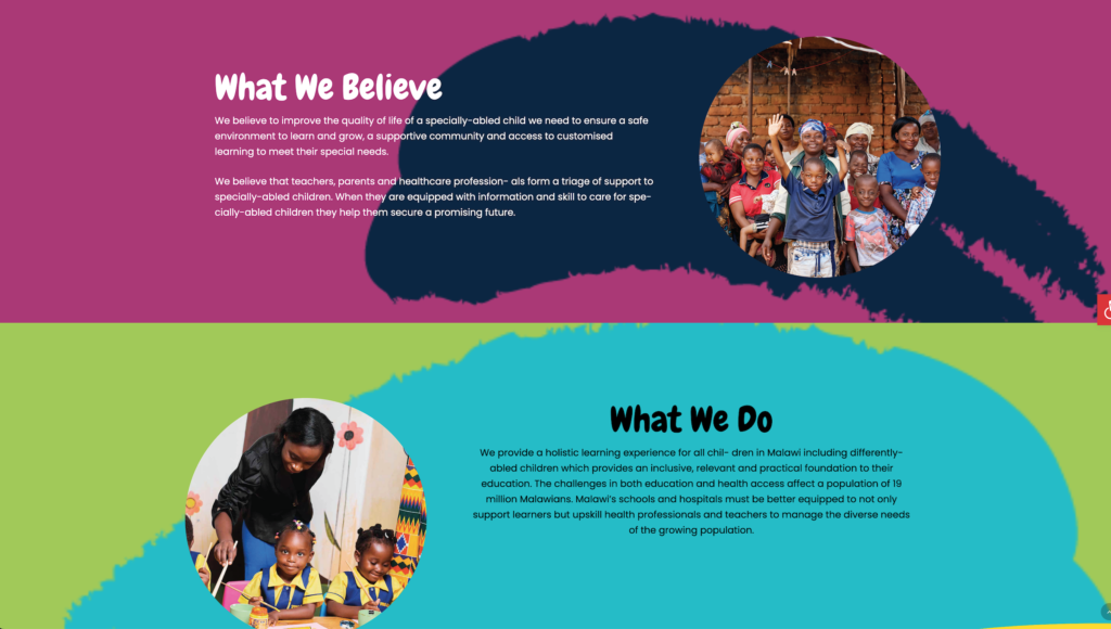
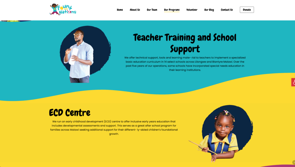
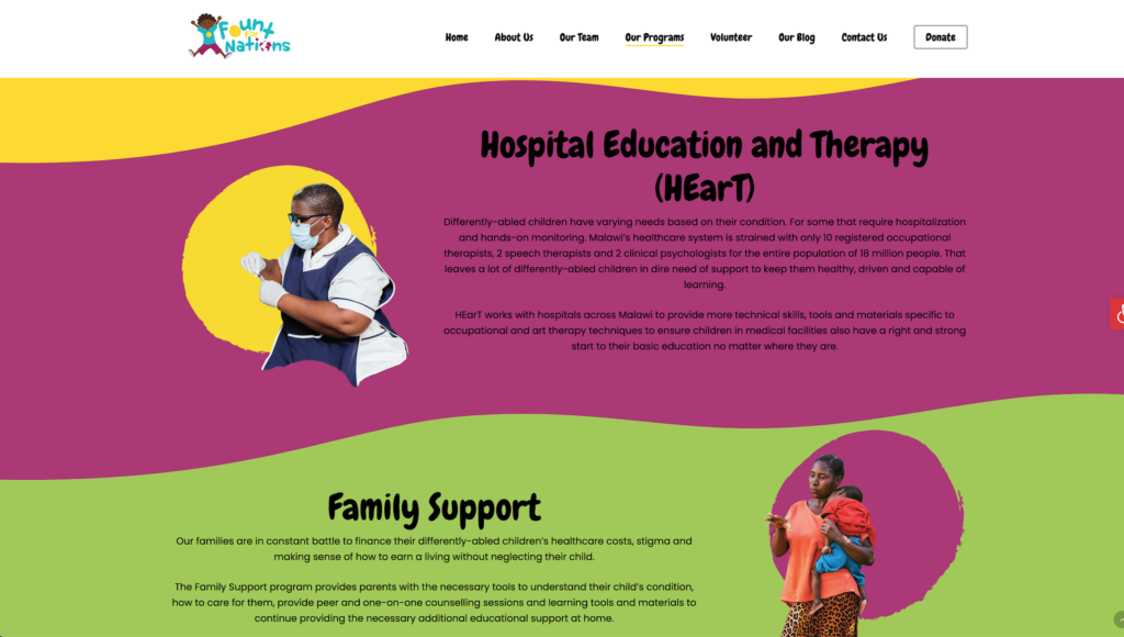
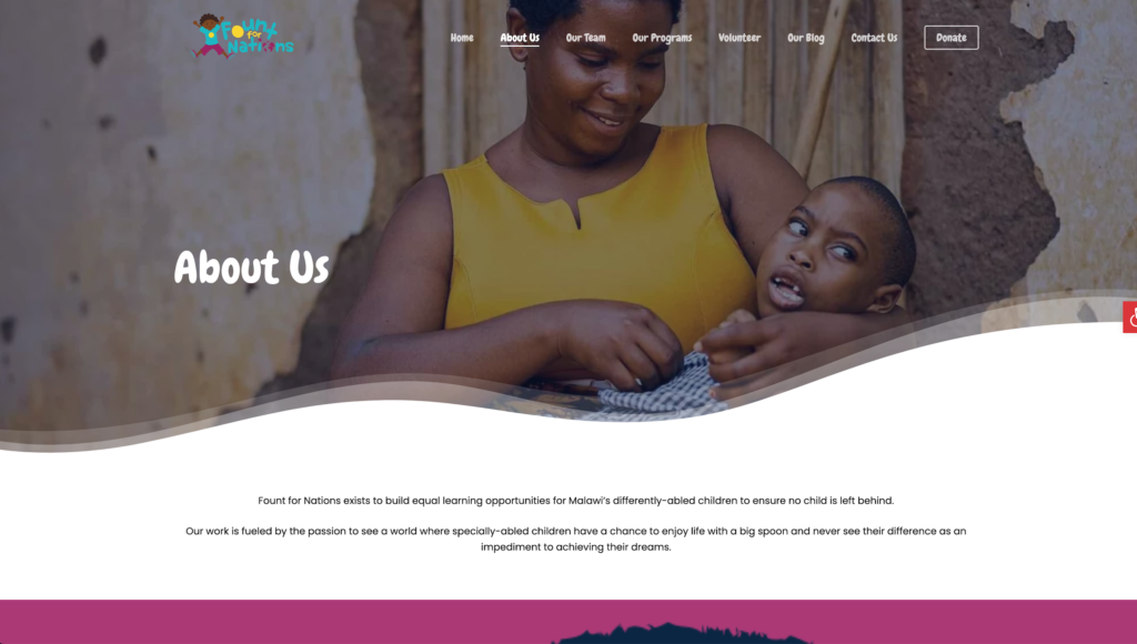
Fount for Nations exists to build equal learning opportunities for Malawi’s differently-abled children to ensure no child is left behind.Their work is fueled by the passion to see a world where specially-abled children have a chance to enjoy life with a big spoon and never see their difference as an impediment to achieving their dreams.
Project Overview
- Client Name: Fount For Nations
- Industry: Non-profit/Humanitarian
- Website Link: https://fountfornations.org/
- Scope: Developing a master zendesk template. Deploying 12 Zendesk Websites
The Clients Dream
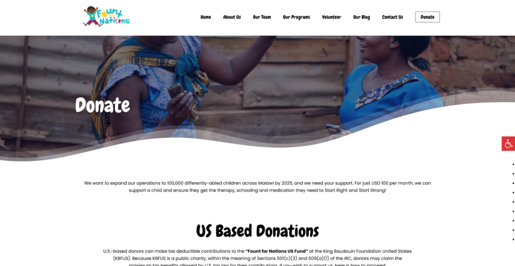
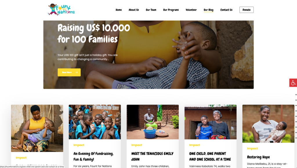
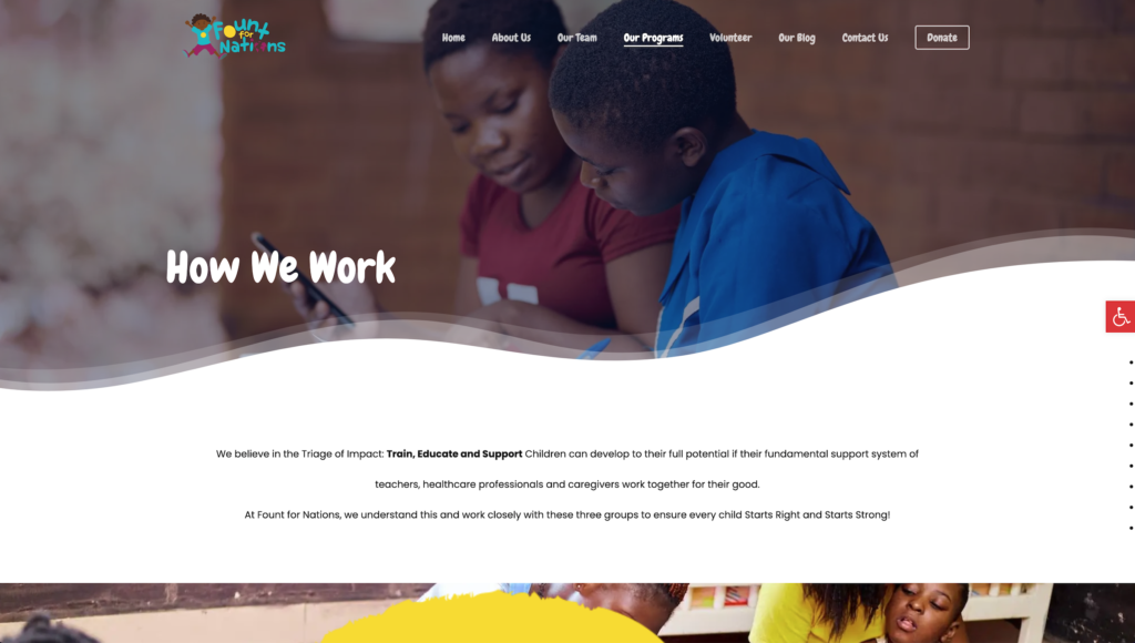
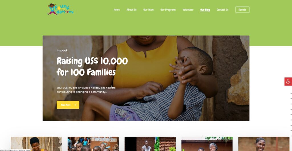
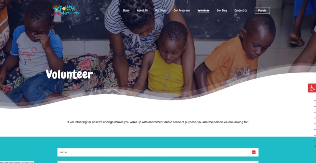
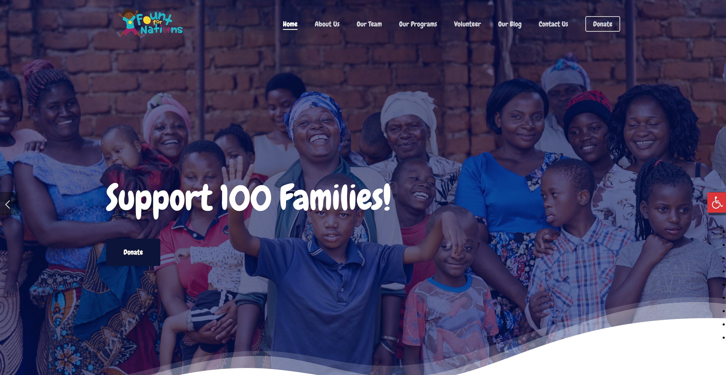
Imagine a digital space where every child, regardless of their abilities, can explore, learn, and have fun. That’s exactly what our client, Fount for Nations, an organization dedicated to supporting disabled children, envisioned. They sought a website that wasn’t just accessible but also a joy for children with diverse abilities.
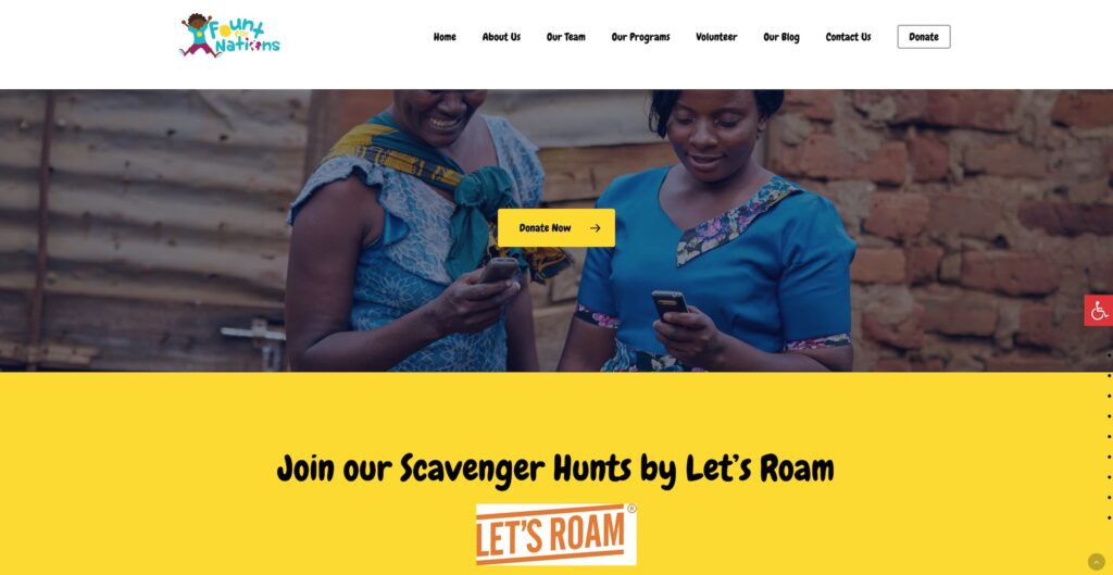
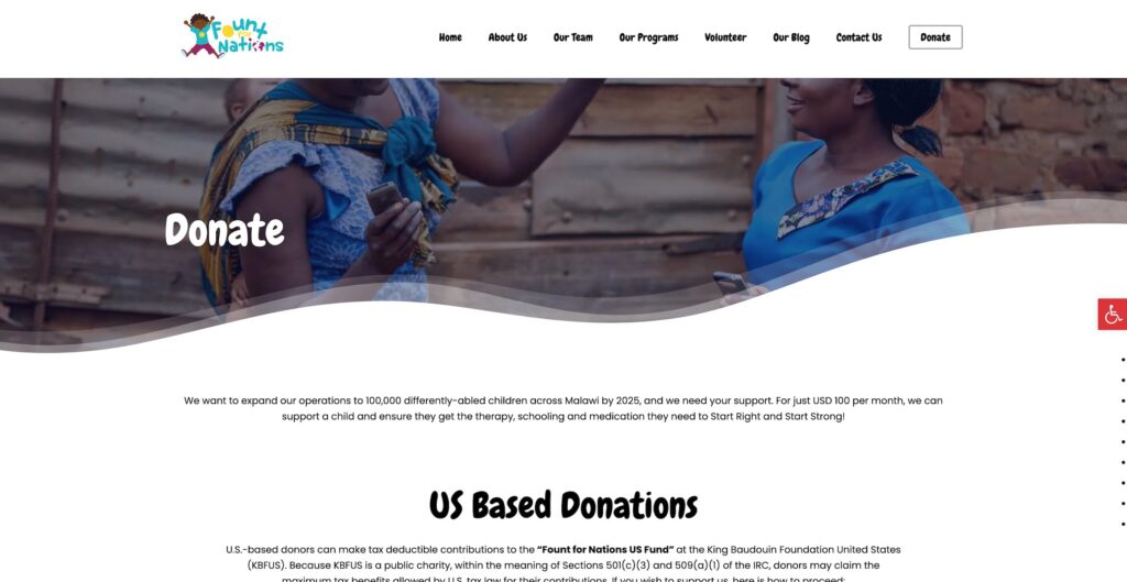
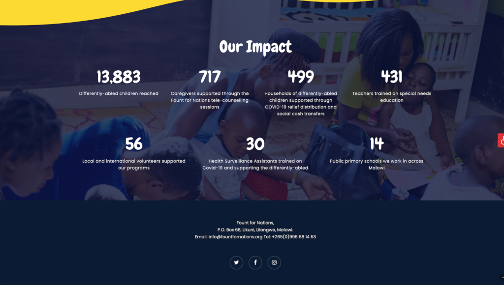
Embarking on the journey of designing and developing a website for individuals with diverse abilities was not just a project but a heartfelt endeavor. Our aim was to create a digital space that felt like a welcoming embrace for everyone. From the get-go, we made sure that every pixel on the screen told a story of inclusivity. Navigating the landscape of accessibility, we didn’t just meet standards; we danced past them, ensuring that our website spoke the language of every visitor, regardless of their abilities.
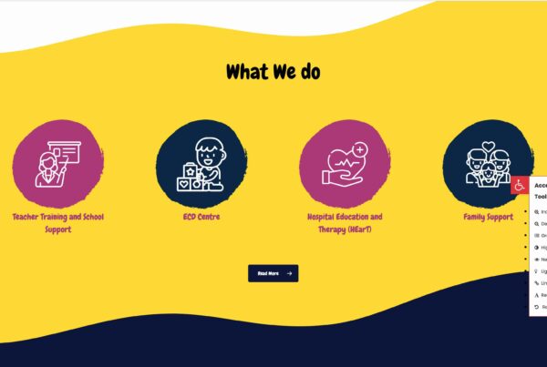
Through playful design, vibrant colors, and careful consideration of user feedback, our website became more than just a digital platform—it became a haven where everyone could connect, explore, and feel at home.
CAN WE DO THIS?
The Challenge
Designing and developing a website with inclusivity at its core posed several distinct challenges that demanded innovative solutions. One of the primary hurdles involved navigating the diverse spectrum of disabilities, ensuring that the website catered to various needs, ranging from visual and auditory impairments to motor and cognitive challenges.
Navigating this adventure, we encountered the challenge of making sure our site was not just user-friendly but universally inclusive. Striking the right balance between simplicity and functionality, we faced the task of ensuring every feature was a breeze for all users, regardless of their abilities. It was a puzzle where every piece needed to fit seamlessly.
From catering to various assistive technologies to creating an environment that felt like a cozy corner for everyone, each challenge was a stepping stone toward making our website a digital sanctuary for all visitors.
While the journey had its twists and turns, the end result was a website that not only overcame these challenges but emerged as a beacon of inclusivity, proving that creating a digital home for everyone is an adventure worth embarking upon.
HOW WE DID IT
Navigating Challenges with Smiles
Our journey began by understanding the unique needs and preferences of our young audience. We dove into playful and intuitive design, ensuring that even the littlest adventurers could effortlessly explore the digital world we were crafting.
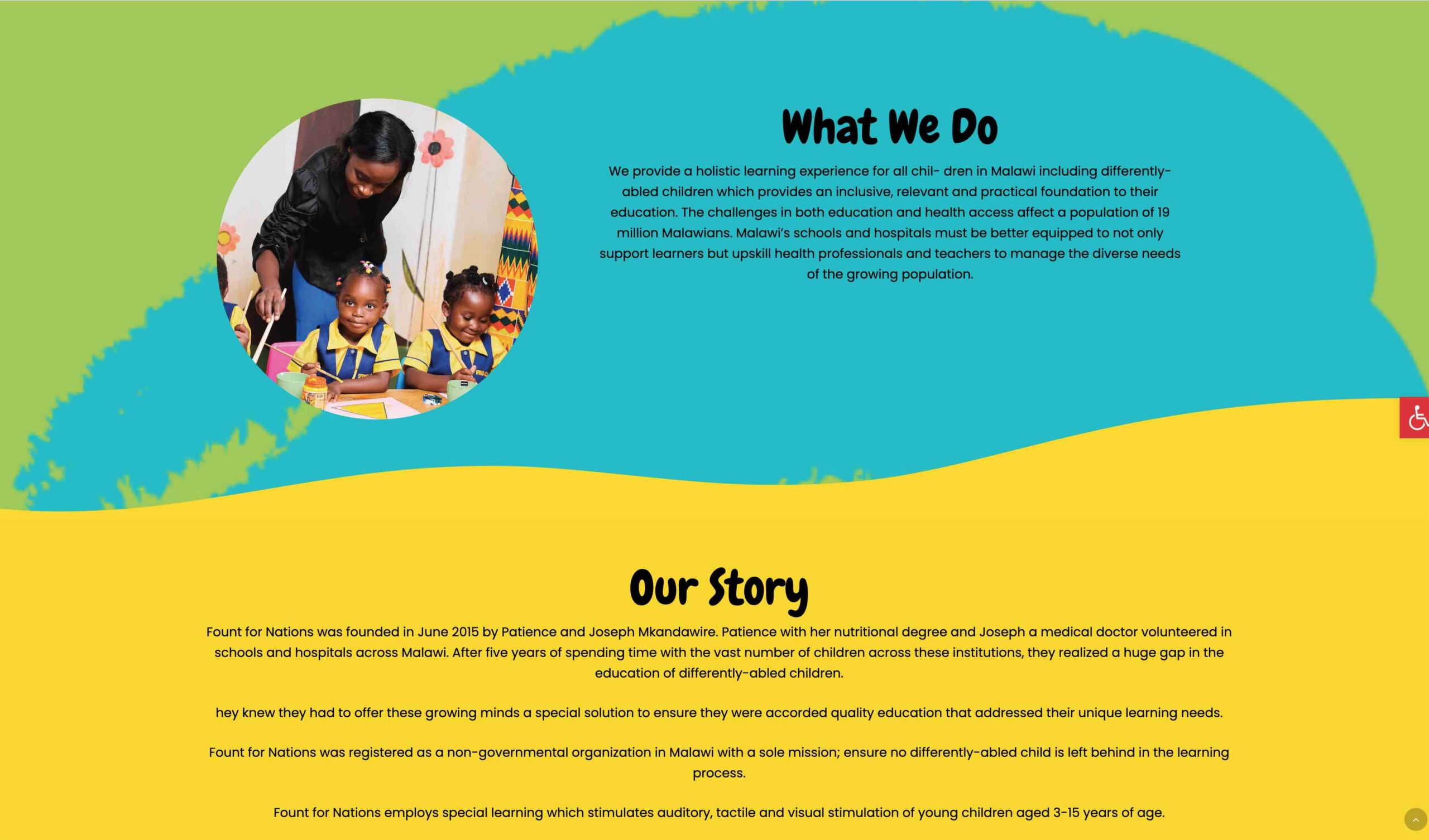
A Rainbow of Accessibility: We took accessibility to heart, making our website comply with the friendly guidelines of WCAG. Each element was carefully designed, from clear and readable fonts to vibrant colors that considered even our friends with color vision differences.
Magic for Every Click: Our interactive features were designed to be magical with seamless keyboard navigation and easily understandable forms. For our friends who rely on screen readers, we added descriptive tales to each image, making the entire website an enchanting experience.
Multimedia, Multitude of Smiles: Videos and sounds became an integral part of our playground. Captions and transcripts ensured that every giggle, every discovery, was shared with everyone. Our website became a symphony of joy, inclusive for all to hear.
Testing, Learning, Growing: In our quest for perfection, we regularly invited our young friends to play and explore. Their giggles, feedback, and insights became the building blocks for improvements. Through each test, the website grew, becoming more user-friendly and responsive.
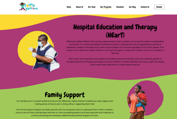
Inclusive Language, Welcoming Hugs: Our words were chosen with care, ensuring that every message felt like a warm hug. Inclusive language became the melody that played in every corner, making every child feel seen, valued, and welcomed.
Conclusion
The result was a digital haven where each child could embark on adventures, learn new things, and simply be a child. Our website didn’t just meet accessibility standards; it became a beacon of inclusivity, proving that digital spaces can be both friendly and professional, ensuring every child feels at home online. The integration of accessibility tools to the website was not just a technical aspect; it’s a commitment to fostering inclusivity, making the digital landscape accessible and welcoming to everyone, regardless of their abilities.
